My friend Randy Richmond runs a few trail running races throughout the year and decided to step up his advertising a little bit this season.
He called me at work and needed some quick and dirty event posters done for each of his events.
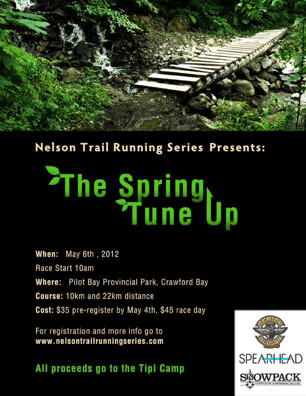
They turned out to be the sort of overnight turnaround type of jobs so for the first one I just dug through some of my biking photos to find one that didn't have a rider and showed a trail, did some quick typography for a title, and some basic content layout. The result looked fairly clean I thought with the exception of the logos which were unfortunately on white backgrounds.
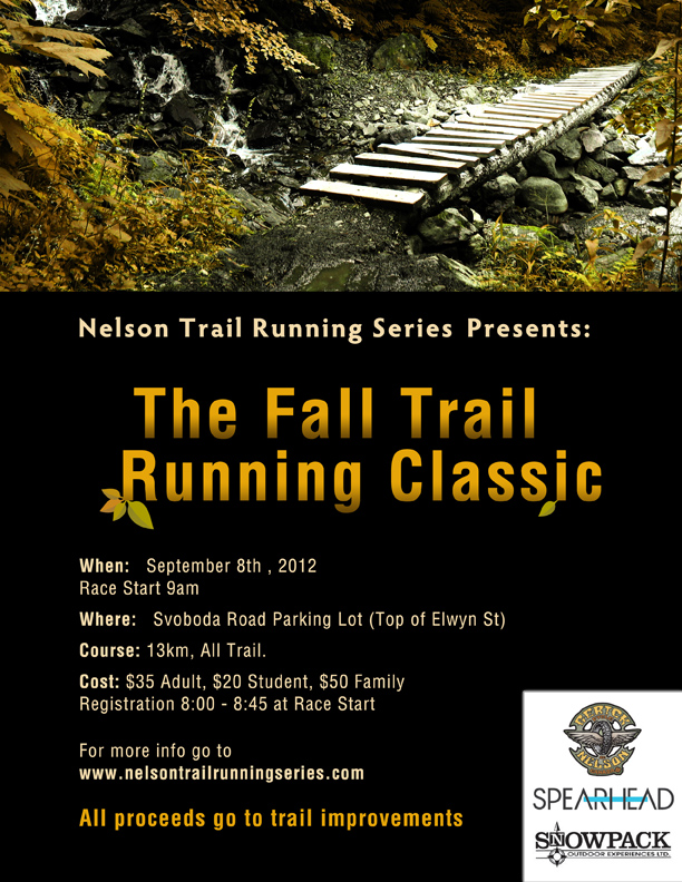
The simple layout turned out to be to my advantage when he called me at the end of the season and needed one done for his second race. I figured we may as well just keep the same design but change the content and the colour. With 10 minutes of modification the second poster was ready. Easy and effective; even if it wasn't the most 'wowing' creation I've made by any means.
- Log in to post comments
- 3638 reads