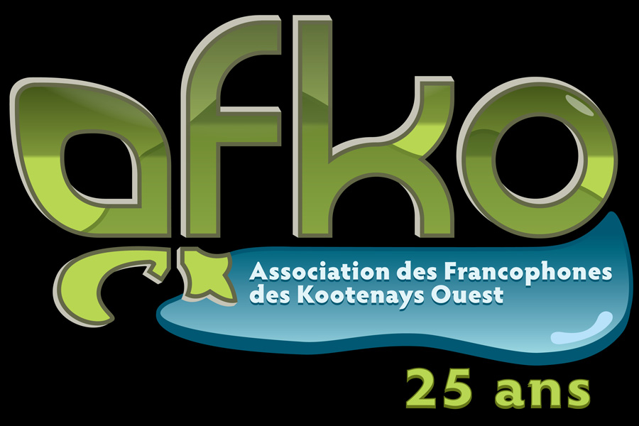
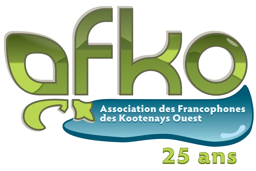
For their 25th anniversary, the West Kootenay French Association (AFKO) wanted to re-brand themselves. We needed to do something that could be read easily at really small sized and could be printed cheaply without looking horrible. It looked like another font based logo was going to be the answer since an icon didn't fit the bill. However, at the same time I wanted to incorporate some graphic elements to add more visual interest.
The question for me was how to incorporate something French, something Kootenay, and a bunch of text into an interesting image.
Like usual, finding a font that I liked took forever but once that was dealt with the first design element became apparent. With a little bit of modification the "A" could be reshaped and expanded upon to resemble a Fleur De Lis.
To capture the Kootenay feel I didn't do anything ground breaking and chose to play off of the iconic lake and mountain imagery that is so often associated with the area. The lake at the bottom of the logo gave me a spot to place the expanded version of the AFKO acronym and the letters above allowed me to work in a subtle mountain shape on top of them.
Add in a bit of depth to the shapes, some gradients, and some highlights to give the logo a bit more visual impact and I called it done after getting final approval. This is one that I think I'll be happy with for a while to come and it's definitely cool seeing it around town.


- Log in to post comments
- 3579 reads
