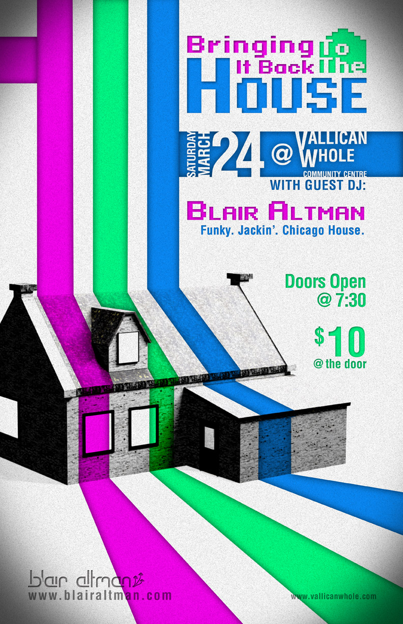
On the 24th of March I'm doing a gig at Vallican Whole out in the Slocan valley. That of course meant that it was time for another party poster.
Unlike every other thing I design I actually knew what I wanted to do with this one before I started. The idea was for something relatively simple but like usual, I spent way more time on it than I should have. My concept for the poster revolved around the event name...
Bringing It Back to the House
What's up with the name? One side of it is the simple play on the fact that I play house music. To give it a little more meaning though it really has to do with me being somewhat frustrated by the music scene in Nelson over the past couple years. Don't get me wrong, for being a small town nowhere near a major city we get some top notch music here. Due to certain trends toward more bass heavy music that feels like getting kicked in the chest while listening to a dot matrix printer fighting a robot I have decided that we need a revival.
For me, listening to house music is all about the feeling. It's about being able to let go, dance all night, and at the end of the night feel uplifted. Good house music is like therapy.
I want to spread that feeling and bring it back to the house.
But what about the poster?
Okay... so the poster. There were a few things that I wanted to try on this. It seems lately everything I do defaults to a dark background so I wanted to go bright on this one and toss in some solid colors that were super vibrant. The imagery was also pretty straight forward. I knew I wanted to have a picture of a house because of the title.
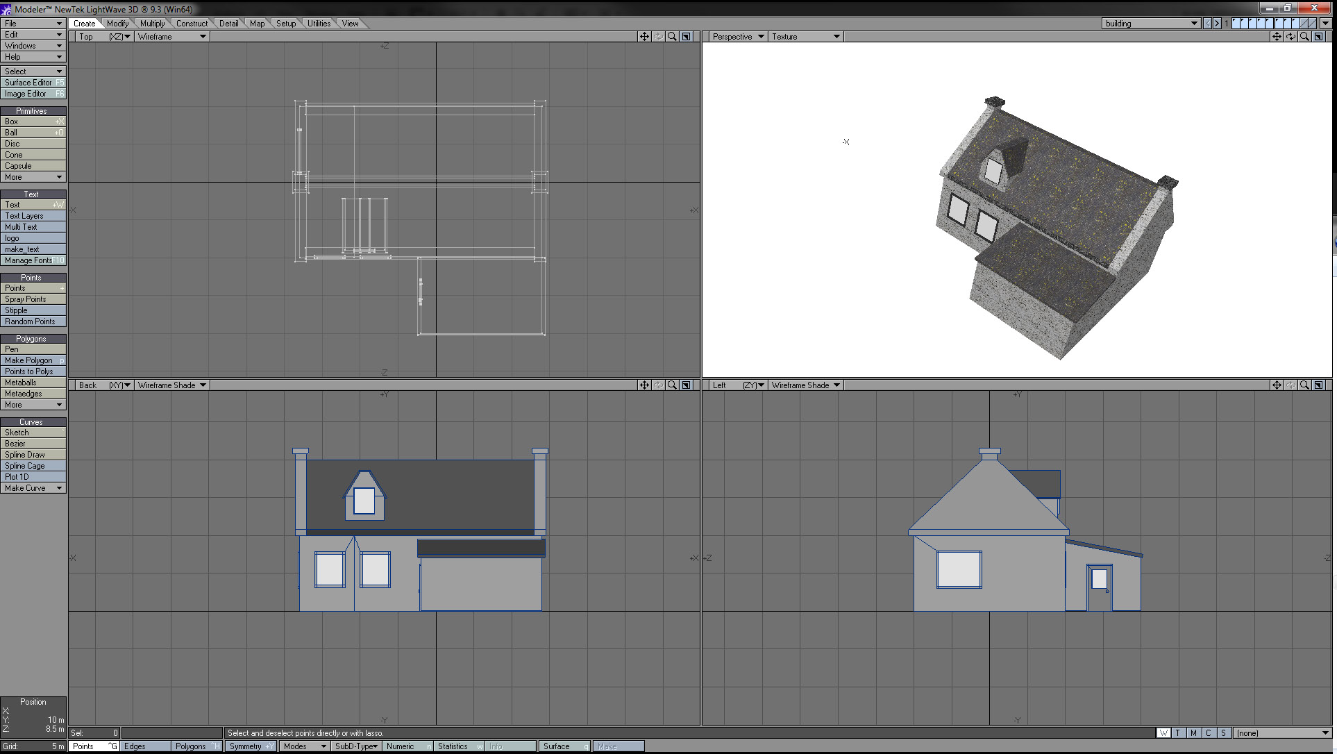
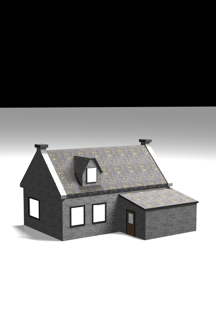
I started off by coming up with the idea for the house. For some reason I just had it in my head that I should 3D model that so that I could control lighting and angle easily. 3D is definitely not my strong point so I'm not sure why I thought that was a good idea but rolled with it anyway. After coming up with a model, doing some quick texturing and lighting, and print resolution render I tossed the final image into Photoshop for some tweaks.
The rest of the poster was pretty easy since it was just text layout. I decided to go with a retro sort of 8-bit system font for the title since it gave the look a little bit more edgyness and since an old looking font seemed to fit with the idea of "bringing it back".
I'm happy with the poster, now I just have to hope that the people that booked me for this actually do a good job of promoting it.
Stay posted for an update on how it goes.
Update:
It was a total flop. Not much more to say than that.


- Log in to post comments
- 3838 reads

Comments
Seamus Gray - Yes, bring it on!
March 09 2012
sweet - 3 dimentions to my heart
April 03 2012