I had the opportunity to make the new version of the Nelson Mountain Bike Guide over the winter. The old version had been out for about four years and was definitely in need of a facelift; that and the club was almost sold out of copies.
I was stoked to be asked to create the new version since I have a pretty good handle on where the trails in this area are and because I have the ability to do all of the graphics. I also had a few ideas of where I could make some improvements from the old issue.
There were a couple of key areas that I wanted to change.
- More logical flow of sections. I wanted to keep the same structure of riding area description, followed by trail descriptions, followed by map for each of the riding areas. In the old book the order of those components got shuffled in some sections.
- Clear markers on each page indicating which riding zone you were looking at. This was simple to do by just doing a colour coded bar at the bottom of each page, with a large title up the left side. It makes it easy to flip through to a zone when you know the colour of it.
- No ads in the book. The ads in the old version looked horrible and I didn't want precious map space taken up by info that wasn't important
- The maps had to be far more clear. The old version used topographic maps which most people couldn't make sense of. This time we licensed Google Earth Pro and used satellite imagery with terrain contours
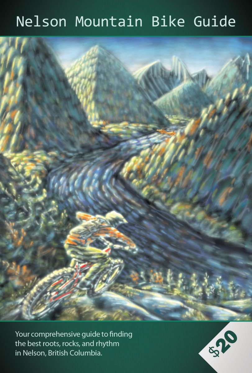
- No amateur photos, and a better cover.
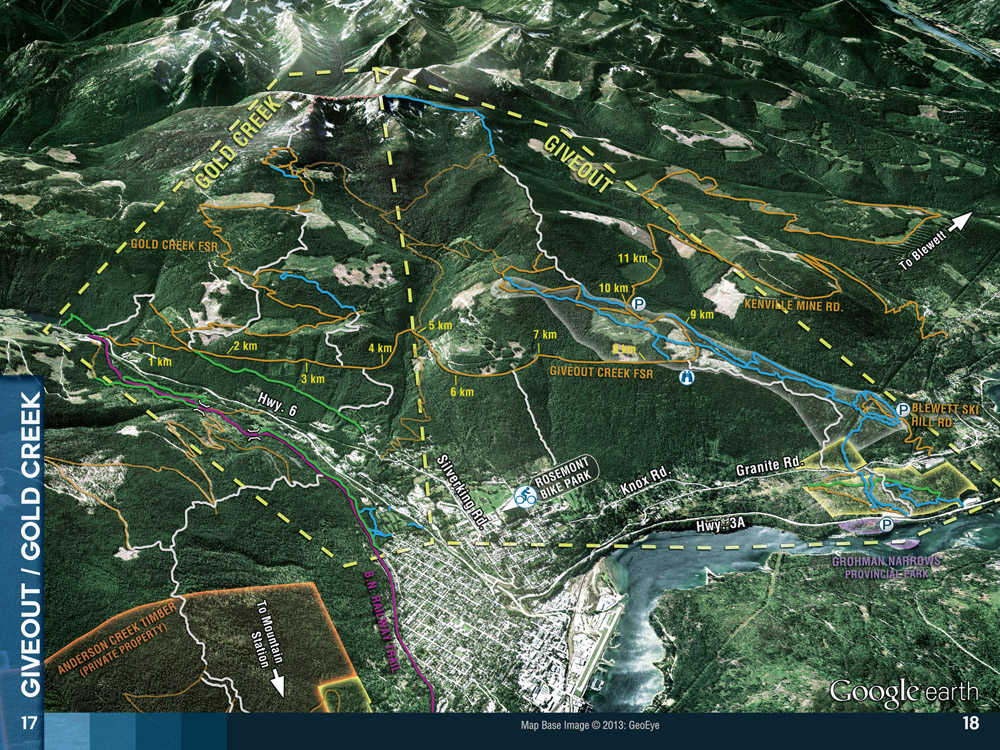
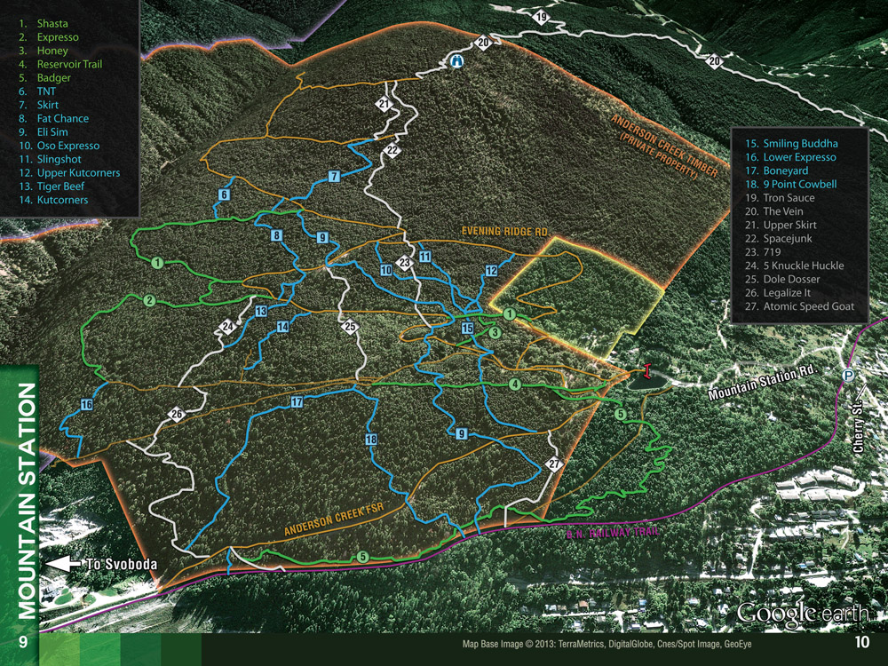
When making the maps I wanted to make sure that each one had some sort of obvious landmark to keep things in perspective to the town if possible. I also had in mind the look of ski resort trail maps where the top of the map is the top of the hill and it's easy to see elevations of runs. The slight challenge with doing that for bike maps is that bike trails tend to cover more distance and often have different valleys and different facing aspects that the trails go through. Using Google Earth made this no problem to deal with and all of the maps have a tilted aerial view to show the terrain but not hide anything.

Overview of Giveout and Gold Creek. The following pages have all of the trail descriptions and maps for the two zones. These areas have probably more different aspects than other zones so an overview map was included to illustrate how connected they are.
I tried to keep the colour coding as clear as possible for each map. Trail difficulties are indicated by green, blue, grey and roads are orange. Any private land or parks is shown by a faded box surrounding the area. The trail descriptions this year also include the length and vertical climbing/descending beside the name.
It was also really awesome this year that we had professional photographers provide the images that were used. Even though we didn't have room for many, the quality level of the few that were squeezed in are top notch.


As well as having professional photos we got Scott Dickson to do an incredible illustration for the front cover. He really went beyond what we had asked for and we're super pumped that he did.

Instead of having graphic ads throughout the entire book, this time it was decided that we would make a map of down town Nelson and do a directory listing of local businesses that wanted to buy a placement on the map and in a "Yellow Pages" sort of directory. I think this approach looked a lot cleaner and the few graphic ads that were included were reserved for businesses directly involved with the bike industry in town.
This is the biggest printed project I have done so far and had a great time doing it.
The new book is 52 pages of pretty much everything you would need to know about Nelson riding. There are almost 40 new trails in this version and most proceeds go back to the club to fund trail maintenance and keeping the trails alive. There are going to be a few places online to buy a copy or it is sold in a handful of businesses in town.
- Log in to post comments
- 4299 reads
